














✔ Audit/ Edit final website
Completed by Alyssa W.
- Assigned to
-
 Hanna
Hanna
- Notes
-
NOTES to keep in mind
Forms -
1. In notifications: only one email should go in the 'From' Field. I updated all, for future reference if you aren't sure which email to place where, please ask.
2. As long as the site design allows, there should only be two gravity forms on a page (top & bottom), so long as the top is dynamic for Mobile & desktop—no need for Mobile & Desktop tops & bottoms. Combine where the design allows. I updated it, please keep it in mind for future sites.
EDITS TO DO
HOMEPAGE
1. Make sure the video is in a lightbox, not directly embedded
MOBILE MENU
1. Add a phone number button above the main mobile navigation menu so people can see it even if the hamburger menu is not expanded.
Contact Us & Contact Us-TY
1. Make sure map goes to the following link and shows a marker, it doesn't show any marker currently:
https://goo.gl/maps/JpvviAW8iyLedXbMA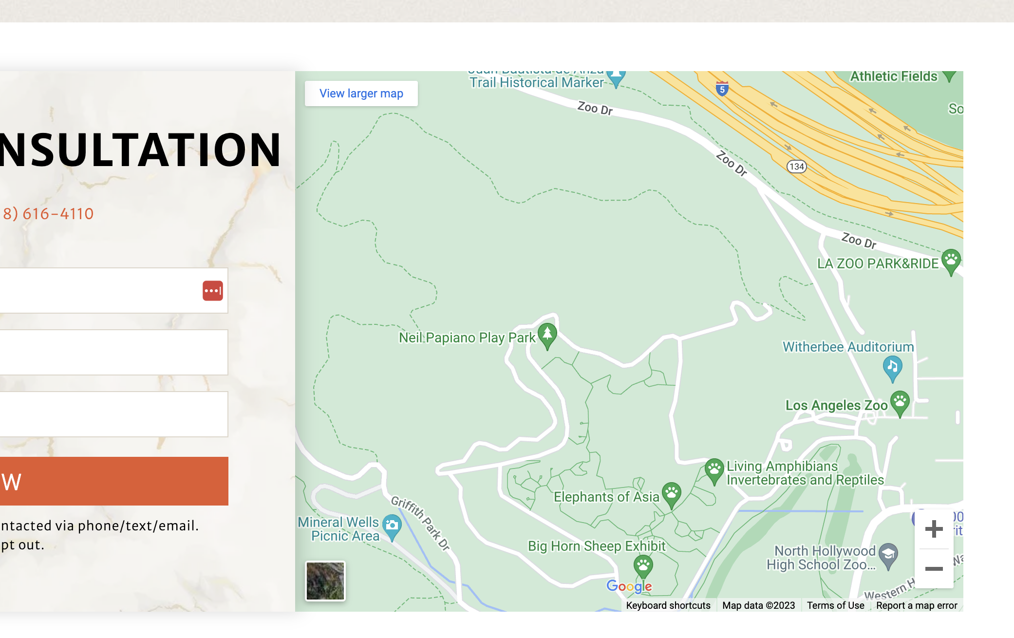
THANK YOU PAGEs - Mobile
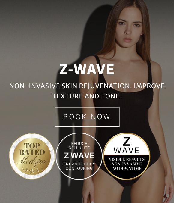
1. Be sure badges are centered on mobile hero images, the look slightly to the left.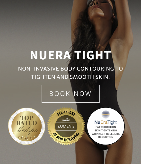

medstar / Letmin123#@!
1. Resolved with Isaac
2. Phone number on header - I'm sorry it wont look good on this suggestion because the height of these mobile images are already calculated, If I do that either the logo or hamburger icon will cover the face of most images, If I add height on the section, these images will be stretched bigger, we do have the phone number on the menu when clicked though. ( see image below). I wont be able to insert the phone number between the logo aswell because it will go too small - I remember we had the floating number before that's why we didnt need the phone number on the top , I'll just keep in mind to add that on the next site using this template :) will that be fine?
4. ( I think this pages cached on my end so I didn't notice sorry. but the design is meant to be left aligned mainly for the purpose of making the service title more readable, I adjusted the text and button instead. Let me know if this works too
yes, this is the url of the video https://vimeo.com/715291546
Isaac can help if you are unsure how to add a sticky header above the nav bar that won't affect the hero image/main nav proportions. Here is a video to explain what I am asking: