








✔ Priority Website Edits before Trello
Completed by Alyssa W.
- Assigned to
-
 Isaac K.
 Jonnamae J.
- Notes
-
This site will be ready for your Trello after these edits as well if you want to do both simultaneously, or however, you think is best. I am going to give Shane the final URL though since he needs about a week to turn the ads on. I few notes below to summarize the video.
Thanks for all your help Isaac, seriously. We will get this all figured out, thanks for baring through the growing pains with us.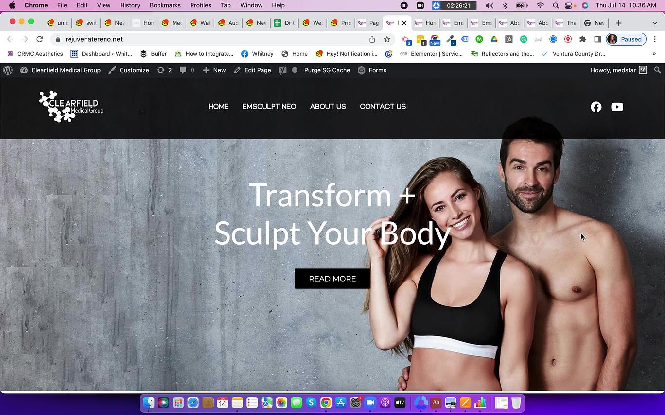
1. Inconsistency in spacing and sizes of Gravity forms.
2. Inconsistency in Hero images for mobile & Desktop
3. Need mobile versions of hero images and before & after images.
4. Formatting padding and sections to optimize based on screen size
5. Some glitches with image scrolling.
6. Contact us page should have Icons of phone/address/email above the map instead of the square address block on the side.
Hyperlinks
Currently, the links are showing as White, make sure matches the theme.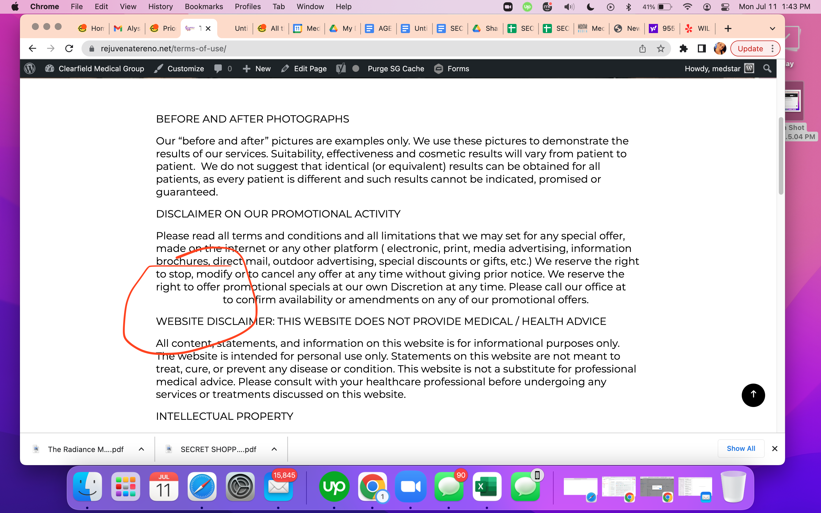
Header Menu
1. The hamburger drop-down menu is not working on the Tablet version.
2. Add phone number button to menu bar.Footer Menu
1. Add Privacy Policy & Terms of Use on the right side of the bottom sticky banner.Make sure the map is linked correctly
1. Should be linked here, currently showing a map of Texas with a Nevada on top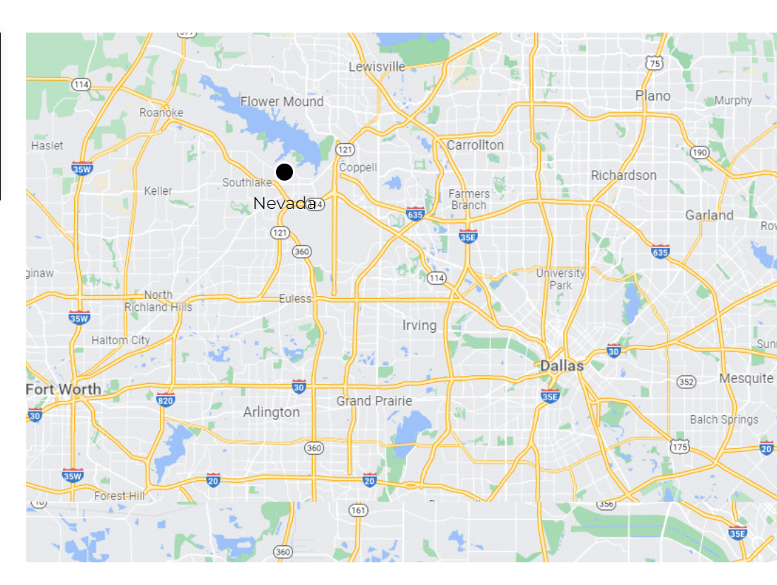
 Ivonne
It's because of the inline-css + this theme only allow to add one title and one graphics in the GF box. If we need to add multiple title of different size. We will need to add additional fields and custom css. I have already notified
In you video when you are checking for the mobile and desktop version. Make sure you select the devices to initiate that particular device emulator and also set the zoom level to 100%. We are using a php that detects the emulator or real device and then only it will trigger the css added for those devices. If you check it while keeping the "responsive" in the dropdown. It wouldn't give you the exact layout. Also make sure once you have select the device from the dropdown. Hit reload. This is very important.
Sure.
UPDATED
5. Some glitches with image scrolling.
It's actually not a glitch. We have made the position of the background images in the hero section FIXED as per
I have now added newer options in the customizer to set colors for different elements on this theme including the body links.
Please check again using the same method I described above.
ADDED
ADDED
DONE
Thanks so much, team!
Thank you so much!
should I add more before and after photos?
In the mean time. You can upload the mobile and desktop images directly on the website to check how they will look exactly and if we need to add any more space above their heads.
updated mobile version
https://rejuvenatereno.net/
https://rejuvenatereno.net/c/