









✔ Changes to website
Completed by Alyssa W.
- Assigned to
-
 Selena V.
- Notes
-
Hi
video: https://watch.screencastify.com/v/uKT3Pl3OSEz1KEgFw0Af
More edits:
1) they want rainbows right? So, can we make with the gradient colors they have in brand bible as part of the menu? So that when you first land on the page, above the fold, their colors are shown. I'm thinking of a menu bar but maybe you can come up with something better.
2) Can we include their tagline "the science of living beautifully" somewhere in the hero or first section of homepage?
3) Can we include these lines in some way in the service section of homepage (like lines or boxes around text?)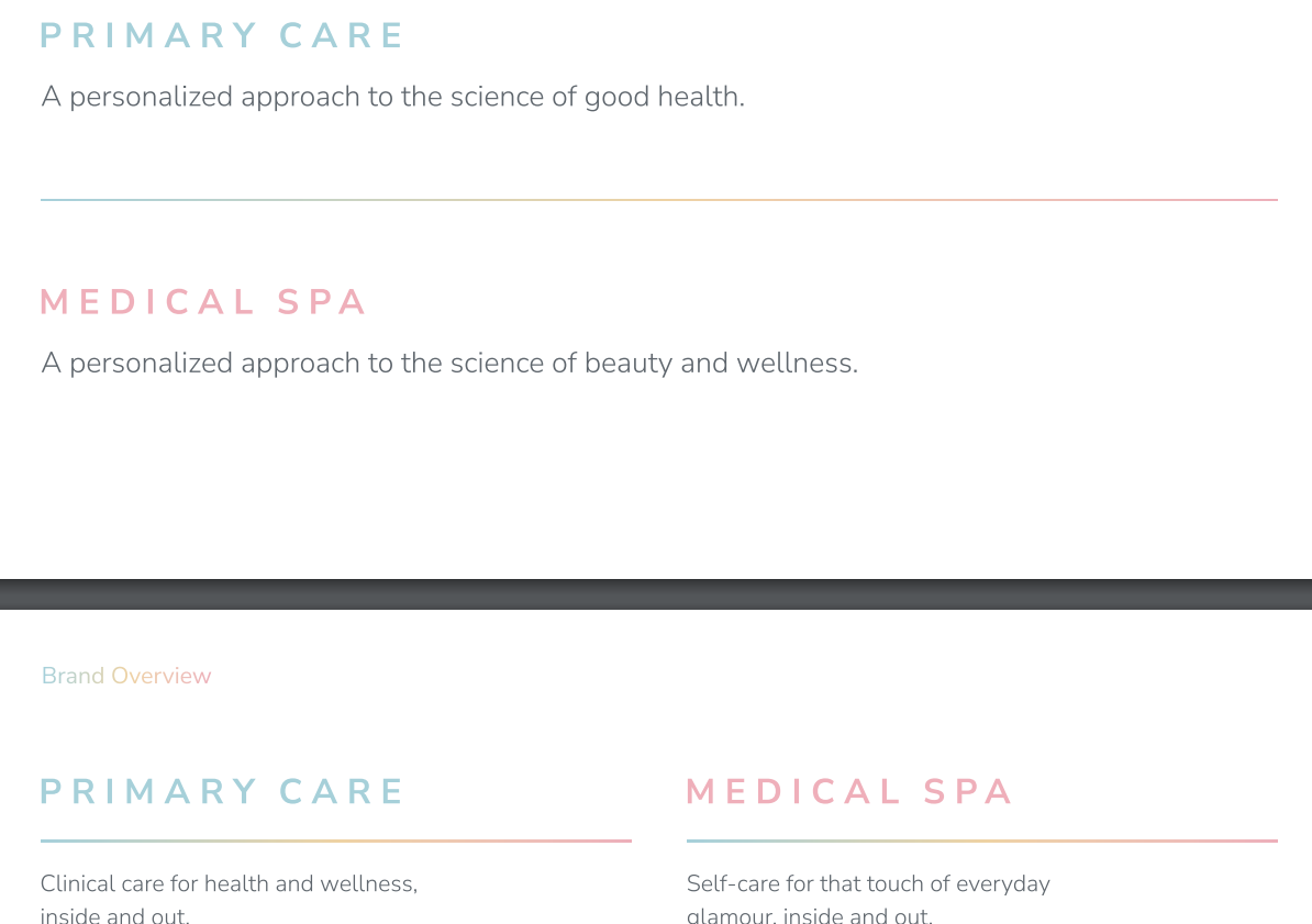
4) Get rid of ripped corners of service photos
5) replace 1st service photo (primary care) with this one: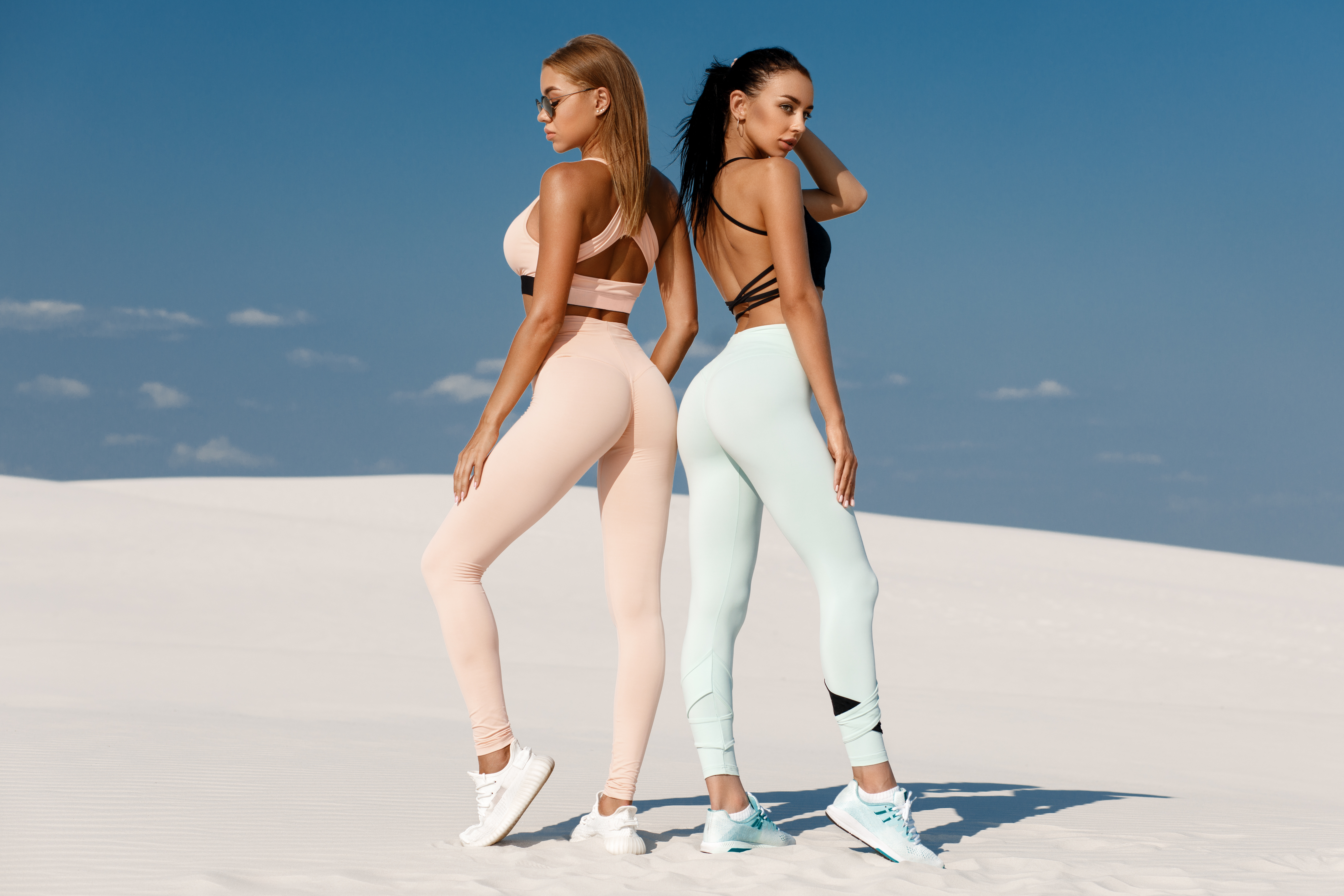
7) About us page photo on hero please change to the below if it fits.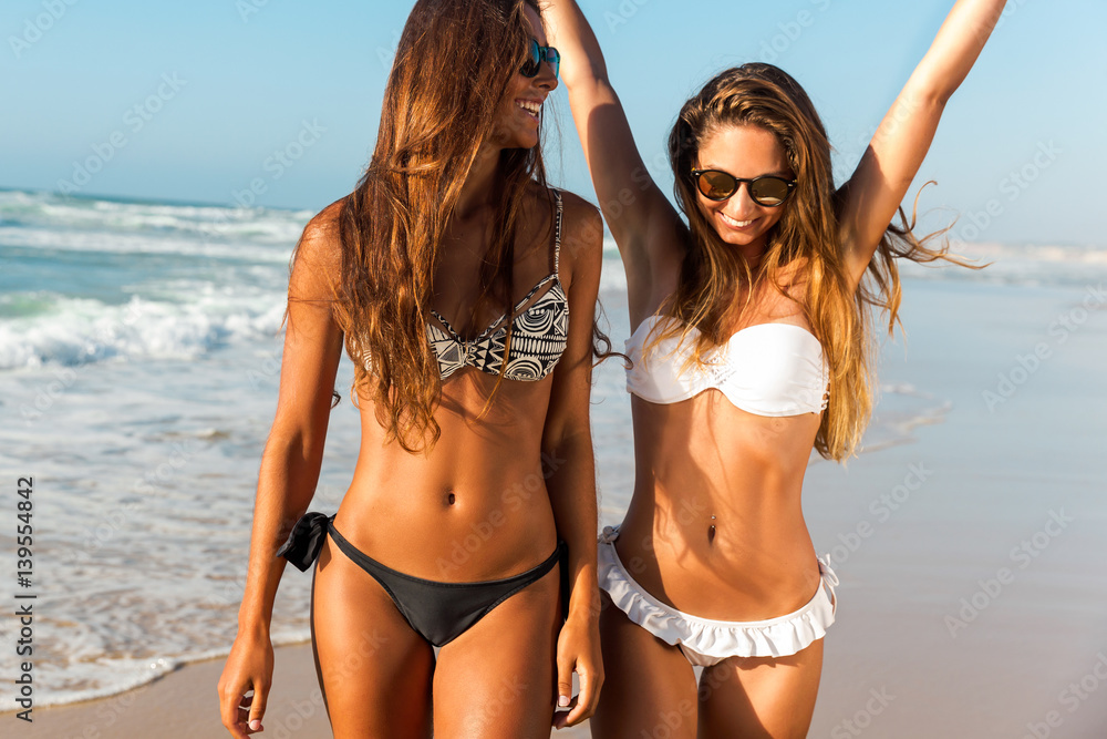
Thank you!
https://watch.screencastify.com/v/x4VpFj9z2QQ2j5BLyyZI
I changed the color of dividers on treatment pages as well as headings.
Their brand font is applied on the homepage and homepage old. I will apply it to treatment pages too.
Here is another edit to be made: https://watch.screencastify.com/v/6LxUsMIiUKabKt3mqLID
Thank you!
Can you get high-quality images for the carousel?
It's full-width now, but images have only 900px width. It would be best to put 1920px for a full-width carousel.
Also, what about treatment pages?
Here are high-quality images:
Can we please replace Contact page hero to this:
Thank you!
1. Overall, including menu bar items, can the font size increase a little bit? In homepage and on pages to make it easier to read? Including on the homepage, in service section, text below headings.
2. Can the logo on the service pages (ombre one) be a little more saturated/bold so that it shows clearly on all pages for example, on page below it's not that clear:
Homepage:
1. For Service section headings, can the font-weight slightly decrease? Can the text be justified?
2. In hero, how would one of these images look for Medical (if they won't work as well as current model, leave current model) In some of the images I chose, we would have to zoom in to the face.
The science of living beautifully.
We are a Tampa-based medspa + primary care facility taking a personalized approach to the science of beauty and wellness.
We believe that the science of living beautifully should be accessible to all -- that’s in location, offerings, representation… everything. A little effort goes a long way to make you look and feel beautiful. I want to help you with that.
4. Can we mute the pattern of the section below the hero even more?
5. In hero, can we please make the "read more" buttons aligned with one another?
6. For the carousel showing their facility photos, can we make the photos slightly smaller so they are not full width. and then please see my question above this sent on Feb 1.
8. Testimonials section, can we add more testimonials and have them on a rotating carousel?
Medical Weight (loss) Management Page
1. Please change "Medical Weight Loss" on menu and on the page hero to "Medical Weight Management"
2. Can we change the photo on Medical Weight Management Consultation to this one:
Thank you!
-Please change the "Skin Tightening" title under the "Body" submenu of Medical Spa to : "Body Contouring + Cellulite Reduction"
Botox page
1. Please add at the bottom a section on "Rebates & Promotions"
then, the Alle logo and this text:
Experience Allē
(and link this webpage: https://alle.com)
ASPIRE Galderma Rewards
ASPIRE is designed to support and reward you at every step of your aesthetic journey.
(and link aspirerewards.com)
Aquagold Page
1. Please change to one of these photos or a diverse model:
VAGINAL REJUVENATION
1. Please change the "Paid During Sex" photo of the grapefruit.
IV THERAPY page
1. Change last photo of the page to this one:
1. Can we add these badges from their current website (https://shop.myhealthandglow.com/meet-the-team) to footer of new website:
2. Contact Us page- can we place map in color instead of black and white?
I made changes. But I have some questions for some tasks.
2. Can the logo on the service pages (ombre one) be a little more saturated/bold so that it shows clearly on all pages for example, on page below it's not that clear:
We are not allowed to make any changes to the logo (color, saturation, contrast, cropping some parts, etc.) because of their branding rules. So what are we gonna do about it?
2. In hero, how would one of these images look for Medical (if they won't work as well as current model, leave current model) In some of the images I chose, we would have to zoom in to the face.
Let me know what you think about new image.
6. For the carousel showing their facility photos, can we make the photos slightly smaller so they are not full width. and then please see my question above this sent on Feb 1.
I reorganized this section. Changed the layout. Let me know your thoughts.
2. Contact Us page- can we place the map in color instead of black and white?
1. They requested to make it more saturated. How do you think it will look?
For example, it's not clear on this page: https://myhealthandglow.healthandmed.net/weight-loss-tampa/
2. Let's leave the one we had, and instead replace the photo on the below section of PDO Threads with the one you had here:
3. I like the re-organization of the facility photos. Thank you!
4. I like what you did to map.
Thank you!
1. Homepage: below hero, on section 1, can you please increase font to 1 point larger? (btw can you send me video on how to do this?)
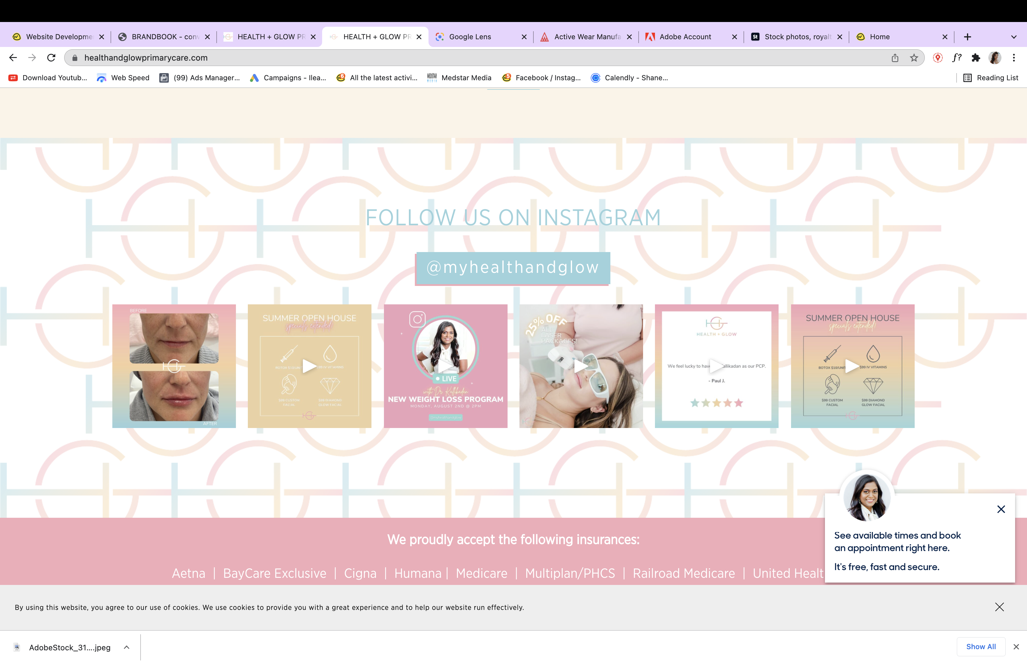
2. Homepage. How will it look if we place moving icons on this first section on a pink background bar instead of where they are now?
3. All website text 1 font size larger. (including menu bar items)
4. menu bar
5. for Medical Weight Management page. the photo at the bottom was replaced, can we go back to what it was (sorry I wasn't more clear but this is not the photo they wanted to switch. they wanted to switch the Medical Weight Management Consultation photo a little higher on page. Can we replace that photo to this one:
6. Can we please change font color of menu items from blue to gray (same as font used on pages?)
7. Vaginal Rejuvenation Page - Can we add the Diva brand logo to the hero?
https://www.obgynpa.com/blog/sciton-diva-launch
1. Here you go:
https://drive.google.com/file/d/123PNzPt19qZAt874YA5sSNsRe_6uYorH/view?usp=sharing
2. Did you mean to move this carousel:
3. I already increased all text for 1px when you requested this last time, do you want to increase it 1px more?
5. I uploaded this new image you sent, but I don't know which image was there at the bottom next to the form. :( Do you remember?
6. Done
7. Done
For #2. yes I meant that carousel over pink (from their brand) color bar.
#3. Yes, increase 1px more.
#5 I don't remember either. but let's choose another one like maybe this:
Thank you!