














✔ Audit Website Redesign
Completed by Alyssa W.
- Assigned to
-
 Hanna
Hanna
- Notes
-
Reminders -
1. Unless the design layout does not allow for it, it is not necessary to create a mobile & desktop for the top & bottom, only one form is needed for the top & bottom. I have deleted the unnecessary gravity forms and made the necessary ones responsive for all media types.
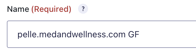
2. When making copies of the forms, ensure the webhook setting does not include any 'copy 1' in the name field. I took care of removing this from all forms that had it, keep it in mind for the future. *Picture is for reference*
 3. All thank you pages should match the parent page, including all disclaimers and all badges. Some pages are not consistent & missing privacy policy disclaimers especially, please check all.
4. For hero image blurbs, please place only Lorem Ipsum instead of placing sentences from the first paragraph with an asterisk(*). This confuses the writers who write the blurbs for hero images so they all got missed.
HydraFacial
1. Enlarge this title a little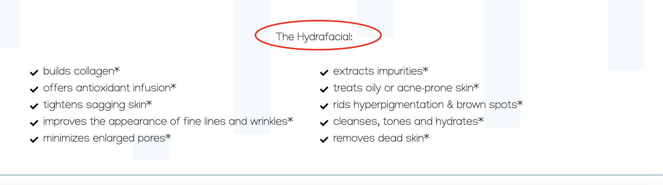
ABOUT US
1. Something seems to have happened with the format, the content is not displaying properly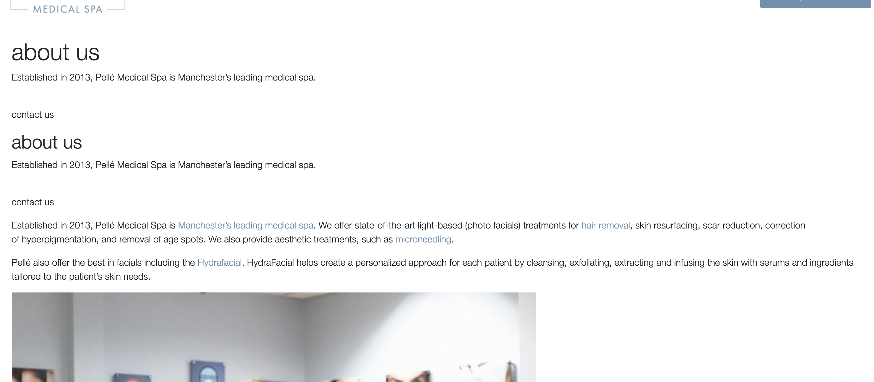
SITEWIDE
1. Make the media strip (featured in icons)into a carousel and link one to an article
2. Make sure all Thank You pages have all disclaimers at the bottom of the page to match the parent page, some are missing.
HEADER
1. Remove Sylfirm from the Body section of the services menu
2. Adjust sizing so the menu is not cut off on the mobile version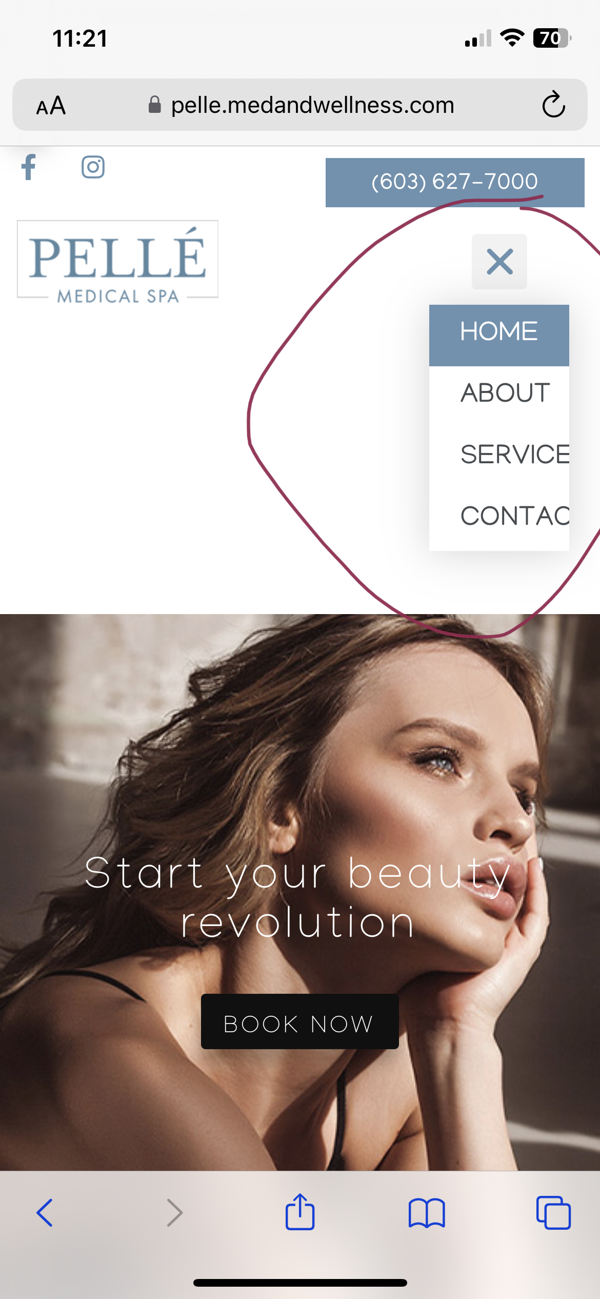
1. Add ADA button and stick it to the footer
BOTOX - THANK YOU PAGE
Badges are missing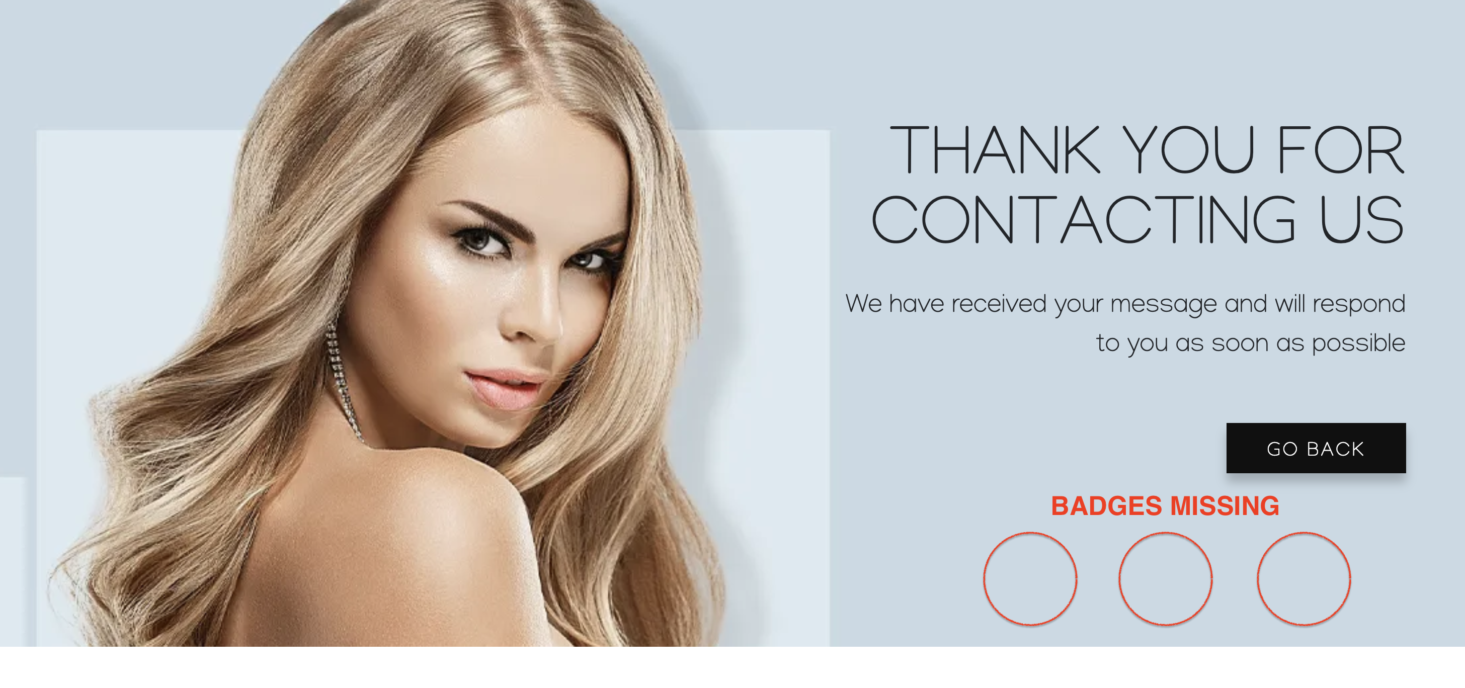
CONTACT US
1. Gravity Form is overlapping the interactive map, pleas make in-line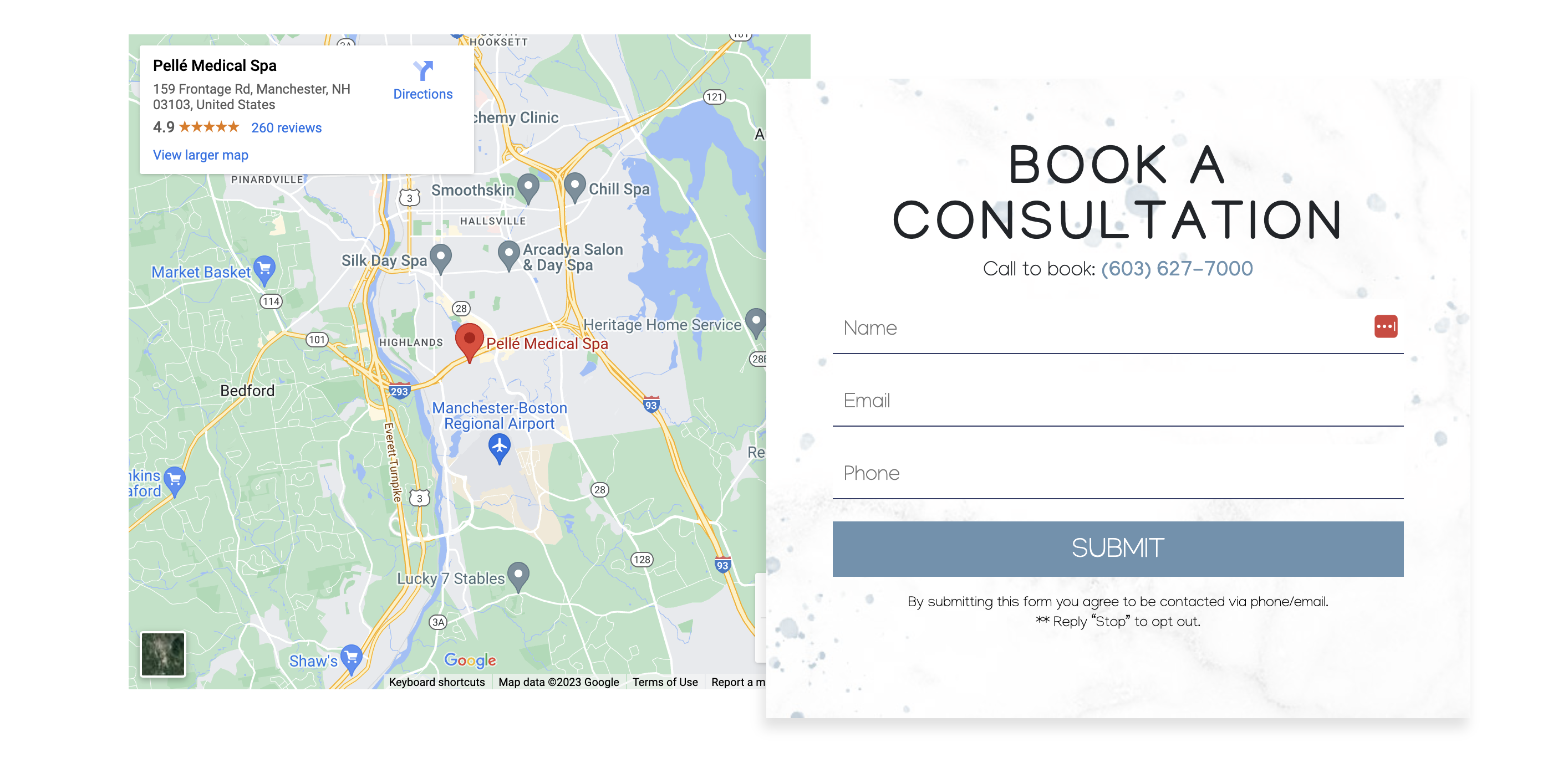
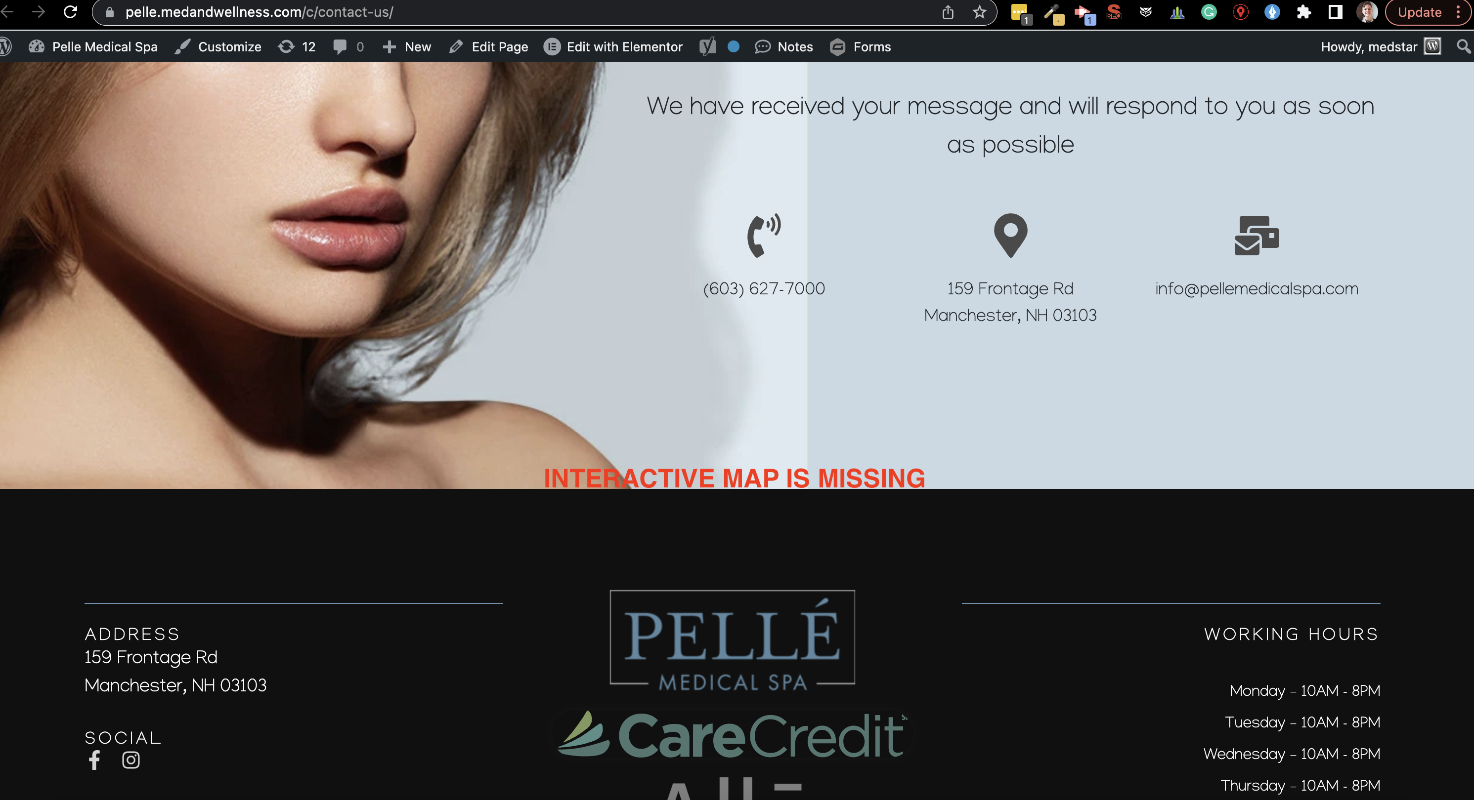
CONTACT US - THANK YOU PAGE
1. Add a GO BACK button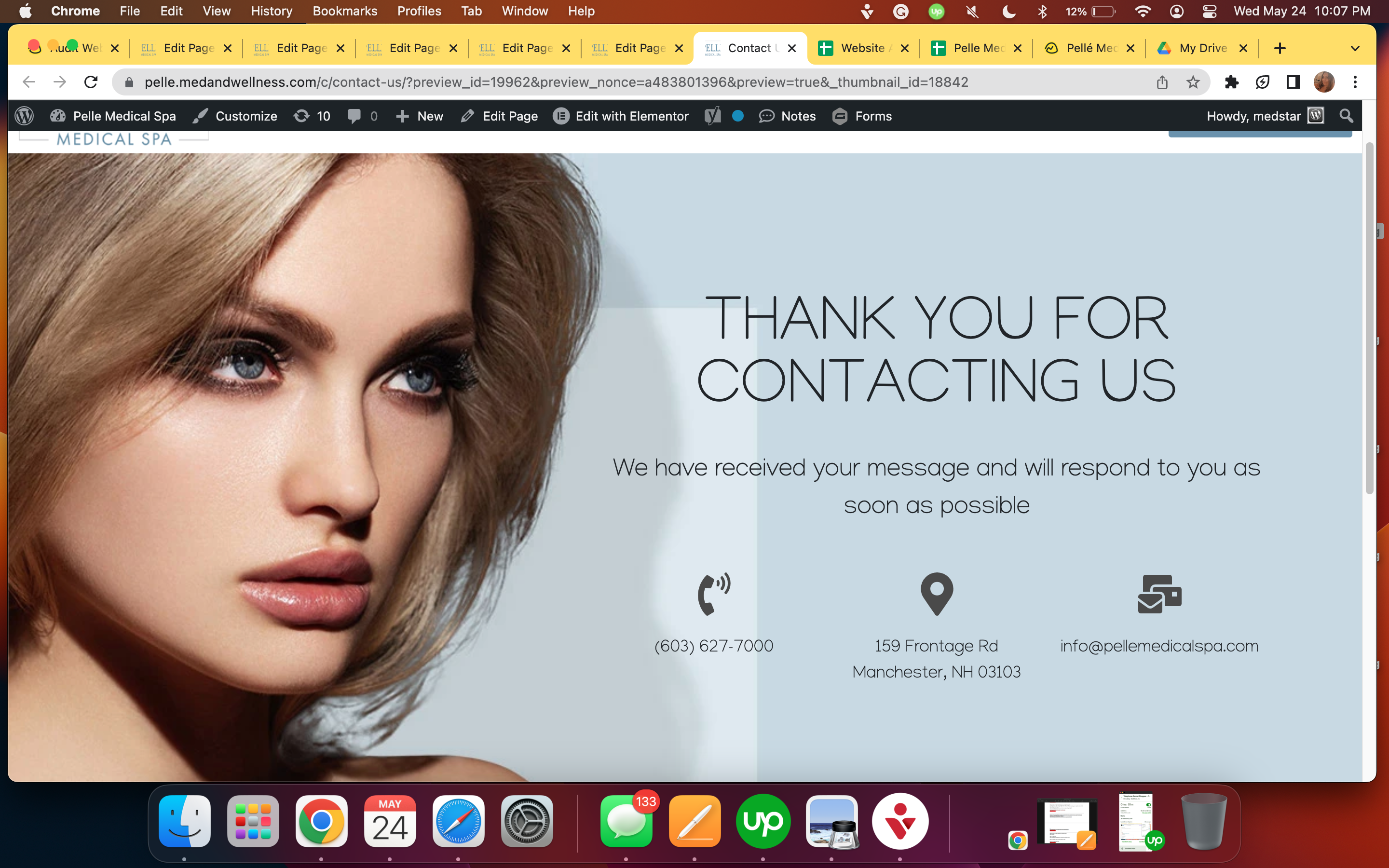
CoolSculpting
1. Add b/a disclaimer: *Results may vary. We are reputable for complete customer satisfaction for completed treatments. Before and after images reflect real results from real patients, although individual results may vary. No treatment is promised to provide permanent results. A guarantee is neither provided nor implied. Statements estimating treatment duration and the number of treatments required are based on the typical experience of our patients, however, individual experiences may vary.2. Add Promotion to Gravity forms, % off should be the biggest and boldest.Get up to50% OffCoolsculpting Elite
SkinCare Products
1. Add the hero image and book now button to the mobile version to match the desktop version.
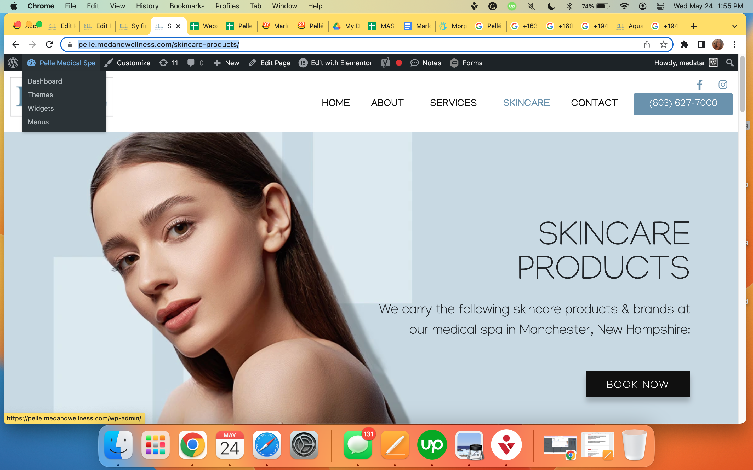
2. Anchor the Book Now button on the desktop version to a gravity form at the bottom of the page titled: Request an Appointment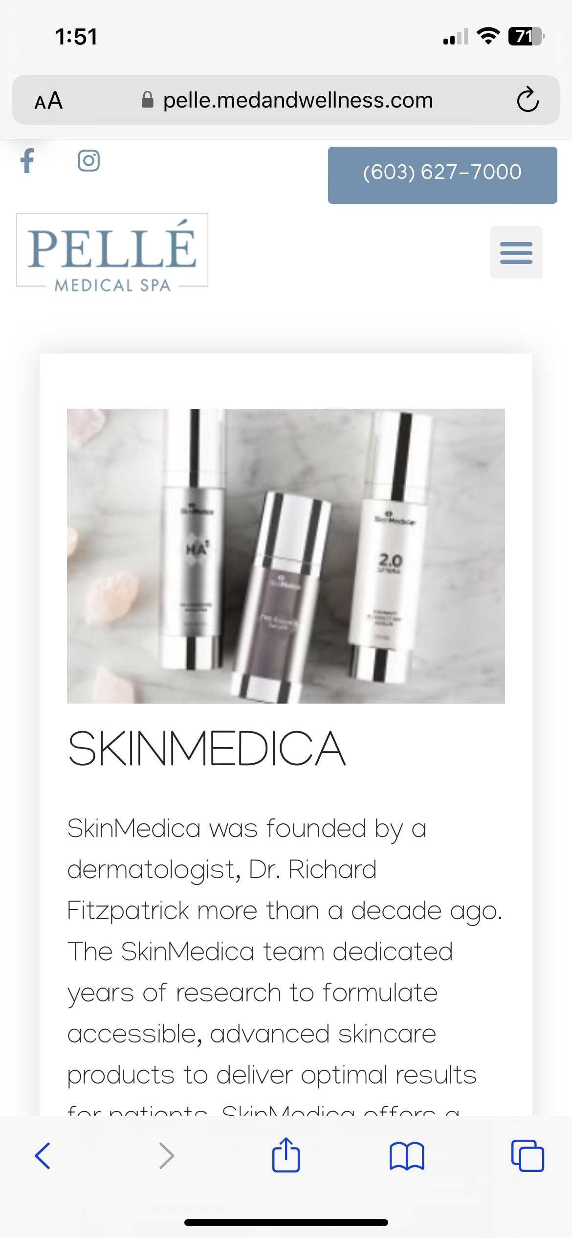
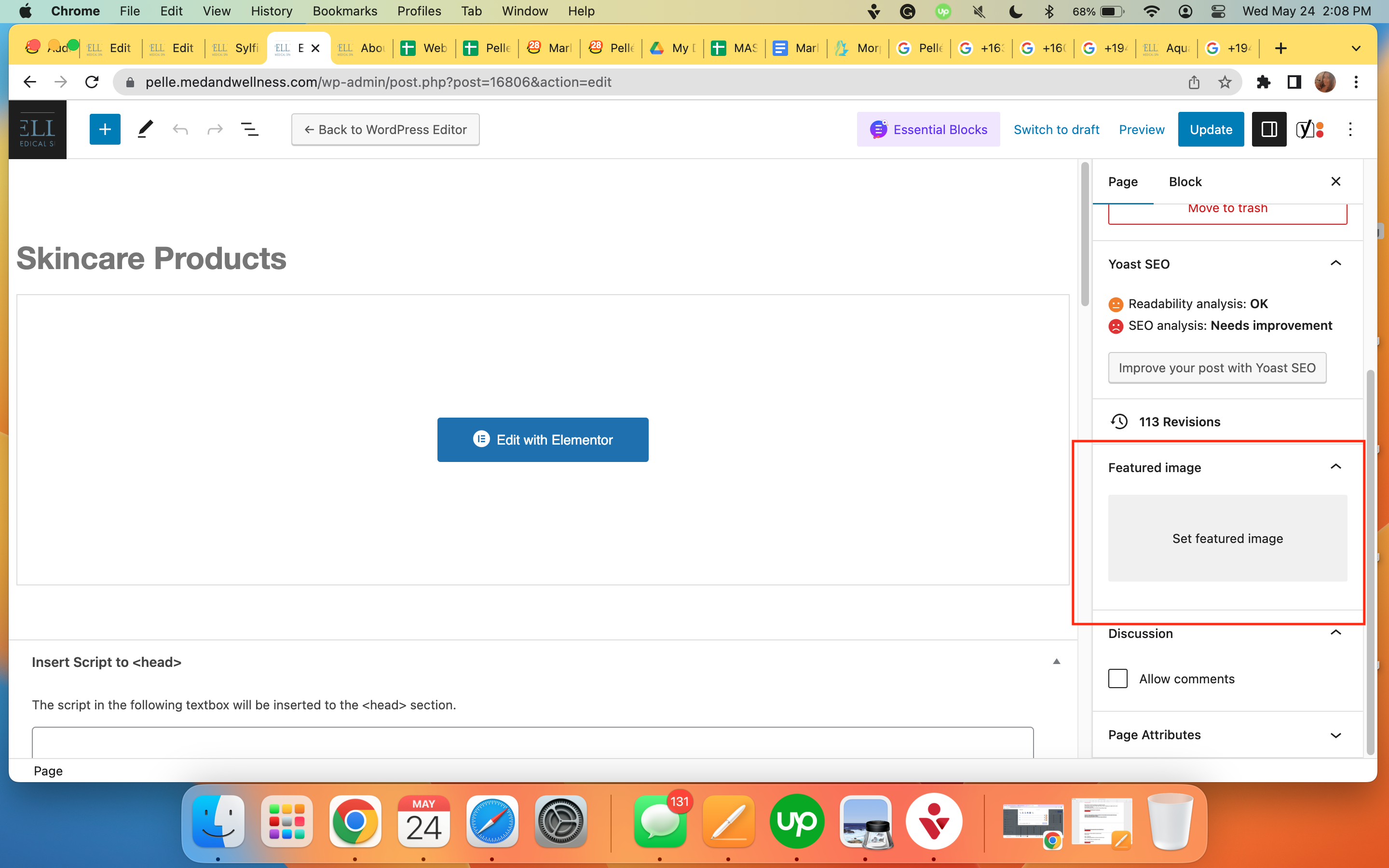
 4. Set featured image
 5. Create a Thank you page
DYSPORT - THANK YOU PAGE
I am not seeing this page created, please create and connect the gravity forms to it.
JUVEDERM - THANK YOU PAGE
Badges are msising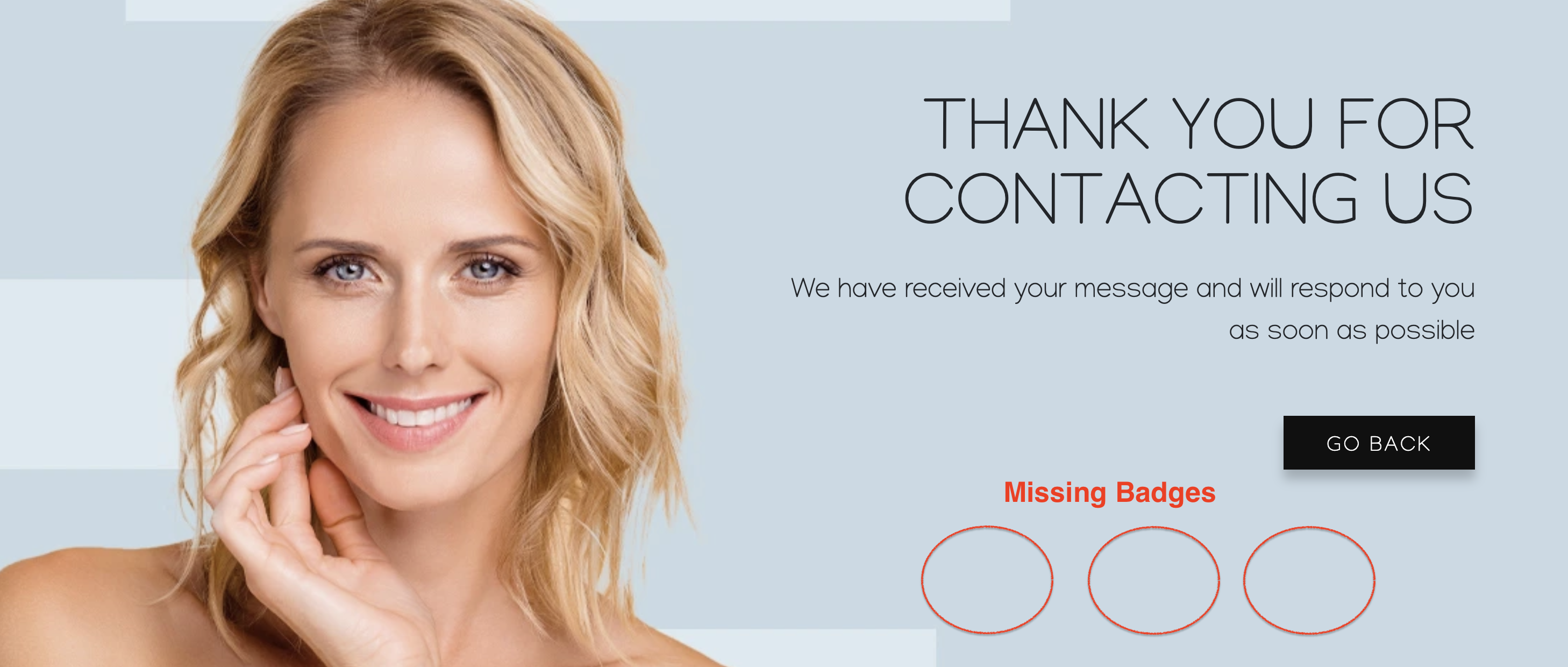
Badges are missing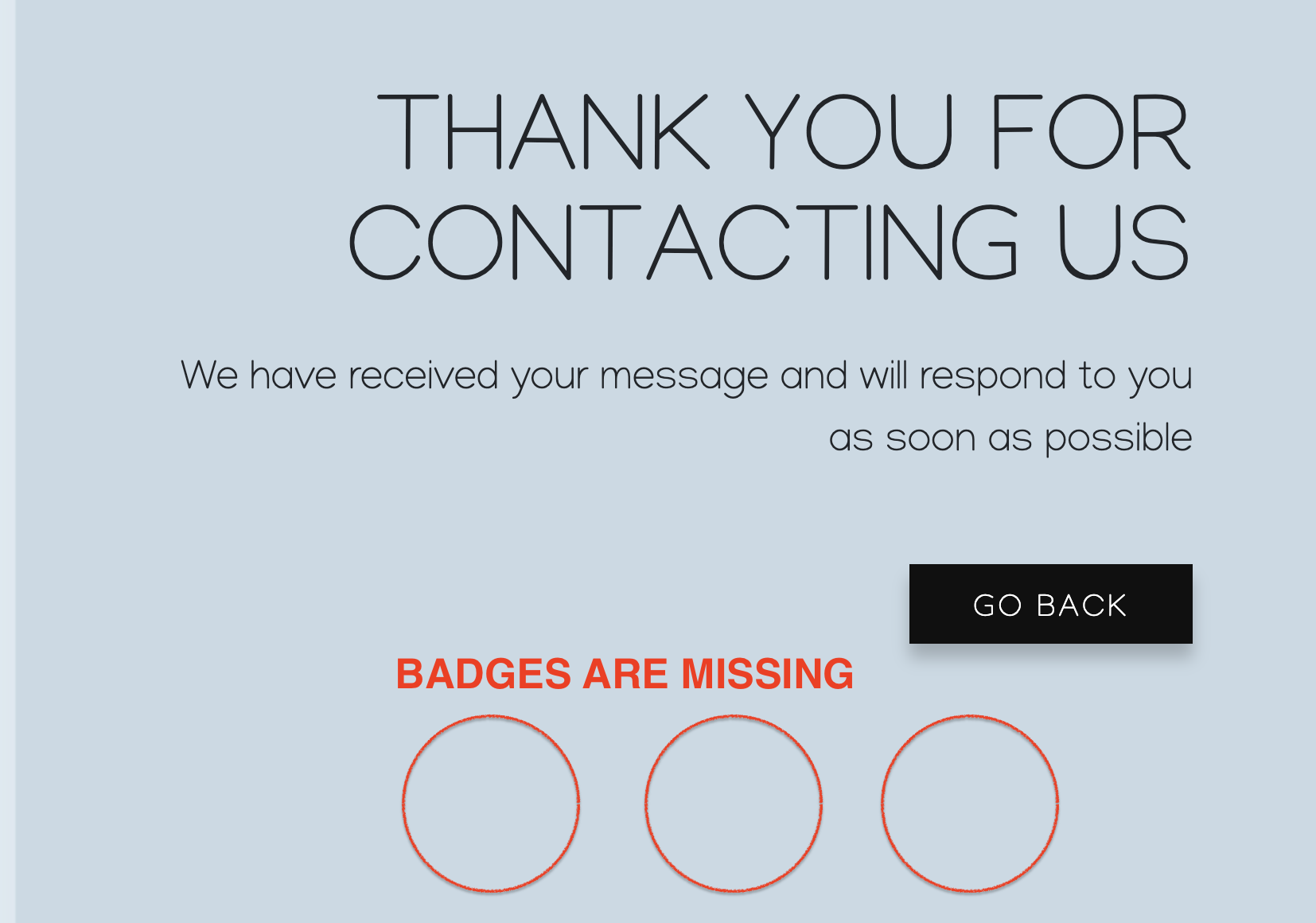
FINANCING
https://pelle.medandwellness.com/botox/
https://pelle.medandwellness.com/juvederm/
https://pelle.medandwellness.com/coolsculpting/
https://pelle.medandwellness.com/semaglutide-manchester-nh/
Can you also please remove Greensky from the financing page?
2. Webhook checking isn't on the checklist , please add this moving forward.
3. I removed "By submitting..." on thank you pages since the forms are removed, I thought it makes more sense. Though aside from that nothing has been removed. I put them back.
4. Hero blurbs that already has prefilled sentences - I got them from their website and It's not quite clear if I should leave the blurb section for the writers, since this is a redesign I believe those are only applicable to new pages . ( This one is noted moving forward though ).
Sylfirm to be removed on body - on the other task this has been requested by the client,
Note: 2 things left
1. Tagging
2. Media strip to be linked on an article. Can you specify what exact link should I put ?
Below are some of the issues I noticed.
#1 Chevron down icon is missing from the mobile menu link that have child items.
#2 Socials icons are too close to the phone button. It can cause mobile
#3 Vertically align the menu links and the phone button. Currently the menu links is little above the vertically center line.
#4 Fix the line-height of the button so that the button text is vertically center.
#5 Logo in the footer is not clickable.
#6 When clicking on "see more testimonials". It's taking to post a new review screen.
https://pelle.medandwellness.com/t/
#7 Mobile header looks clustered. Also the social icons and the phone button on the right are not vertically center.
#8 Content in the footer is not properly aligned.
#9 Back to top icon is overlapping the text in the footer.
2.
3. Got the menu more aligned,
4. Line height and padding adjusted
5. Site logo on the footer is now clickable
6. Testimonials button , it was not originally on the source site so I just deleted it,
7. For some reason even if i set them to be horizontally centered they still dont look aligned, I just recreated this column:
8. When I checked on the editor the alignment are set properly, though when viewed outside it looks misaligned, I hard refresh the page and now looks aligned, no changes on the editor made
9. Top icon isnt overlapping anymore here,
I just reviewed the website again. Can you please update the below?
# The header menu in the mobile version is still look clustered. Please add some white space at the top and also b/w the first and second rows so that we don't have mobile usability issues in GSC.
# Also vertically align the plus icons with the menu text links. Please see below screenshot.
# Also are you able to vertically center the logo? Currently it has more white space at the bottom.
# For the social icons in the header. Increase the white space below them by 10px.
# Include "text" in the form disclaimer. So it will be
By submitting this form you agree to be contacted via text/phone/email.
# Increase the blank space b/w the title and it's text and decrease the space b/w the address text. So that there is more space b/w the title and it's description text.
# Also are you able to vertically center the logo? Currently it has more white space at the bottom.
Header logo is already set to middle vertically but looks like there is a padding on the jupiter main content theme,
Also vertically align the plus icons with the menu text links. Please see below screenshot.
Mobile menu sub indicator has been aligned,
Social media icons on the header increased to 10px padding-bottom
# Increase the blank space b/w the title and it's text and decrease the space b/w the address text. So that there is more space b/w the title and it's description text.
Footer: added space on the title, the line height on the address has been reduced as well
# Include "text" in the form disclaimer. So it will be
By submitting this form you agree to be contacted via text/phone/email.
- For this one, they asked to remove the "text" on all forms please check on the other task,
# The header menu in the mobile version is still look clustered. Please add some white space at the top and also b/w the first and second rows so that we don't have mobile usability issues in GSC.
let me know if this one works better, padding between the section is 20px
Yes. The mobile header looks better now. Thank you.
Can you please share the link to the task here?
I updated the desktop logo to bring it vertically center on my end.
Thank you for all your help.
Please correct me if I am wrong, Isaac: Re: Website Redesign - Pelle Medical Spa - www.pellemedicalspa.com - NR
You can access the old website from the below URL and copy the metadata on the new website. We want to have the organic seo juice the old site earned over the years on Google. Let me know if you have any questions or if I should reassign this portion. Thanks for all your effort on this redesign!
https://pelleoldsite.wpengine.com/
Login prompt - demo / demo123
wp-admin - pellemedical / RVOVDx0^S!LSm$rfViY*qkq
RVOVDx0^S!LSm$rfViY*qkq1
pellemedical
RVOVDx0^S!LSm$rfViY*qkq1
On this login prompt. You need to put the login prompt credentials that I shared above.
demo / demo123
Can you try on a different browser too ? Or can you screenshare ? Thank you!
This is the log in after the demo login prompt
pellemedical / RVOVDx0^S!LSm$rfViY*qkq1
demo / demo123 in the login prompt that you are getting on the wp-admin page.
You need to make sure every time you see the below login prompt on your screen on any page on the website including /wp-admin/ you need to input demo / demo123 regardless of whether you have already input this and was able to access the homepage as you showed in your video.
So basically every time you see this form. You need to input.
Username: demo
Password: demo123
And on the below form. You need to input.
Username: pellemedical
Password: RVOVDx0^S!LSm$rfViY*qkq1